Random Nitpick - Placement Costs Barcharts
Google's "Chip Placement with Deep Reinforcement Learning" 28 Sep 2021I wanted to share this small detail I picked up while reading1 this paper on a new methodology for faster chip floor-planning using machine learning (the methodology that google used for their TPU v2).
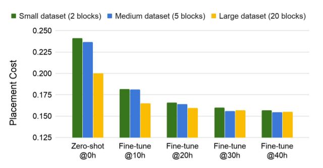
While parts of the paper were incredibly confusing for me, I did notice that in their figure for placement costs in zero-shot (no additional training) and fine tuned model, they start their bar chart from 0.125 rather than 0.
While this isn’t normally a big of a deal (you probably have seen plenty of barcharts like this) - this visualization falls under a subset of “misleading graphs”. Misleading graphs are visualizations that misrepresent data (intentionally or unintentionally) that cause the audience to draw inaccurate conclusions. For instance, in the two visualizations below there is a misleading and more accurate bar chart modelling opinions on Brexit.
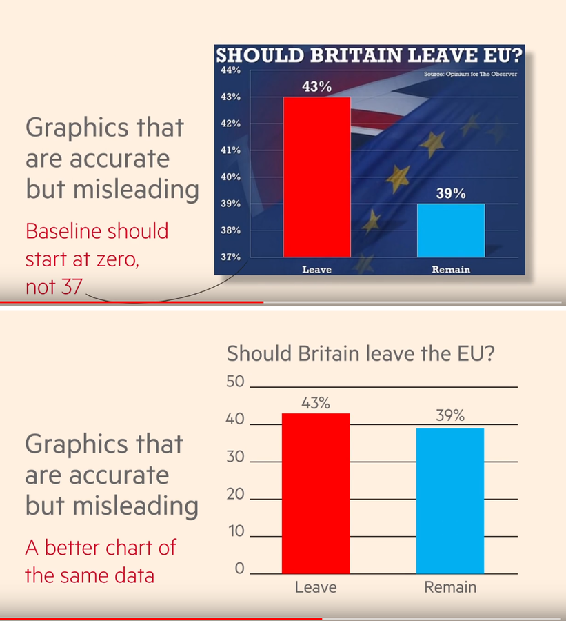
The top chart indicates that there is strong support for Brexit because the red bar is (mathematically) 3 times taller than the blue bar! Even though the numbers show 43% versus 39%, someone could interpret this graph that citizens strongly support for brexit rather than against. The bottom chart still models this support for brexit, but by setting the baseline to 0 the red bar is only ~1.1 times taller than the blue bar2.
Why People Care About Misleading Graphs
Being accurate is important, and it’s easy to group these critiques as pedantic, or relating to intellectual insecurity. However, misleading graphs have been used to push agendas or products - misleading their audience with the guise of rigorous statistics (ex: the example I used earlier). There’s plenty of documentation of that (with a lot of overlapping examples) - so here are some links to read through
- Fox News Exaggerating Romney’s Tax Plan
- Plenty of examples from statisticshowto.com
- Fox News on healthcare
- Fox News on Unemployment Rate - although this has nothing to do with barcharts
The common solution to misleading barcharts is start your barcharts from 0!
Weird Thing
As a small tangent, I’m open to the idea of legitimate reasons for bar chart cropping. Let’s say that your changes have implemented a 5% decrease in costs for a project. While 5% of $50 isn’t very impressive, 5% of a billion dollar budget is still 50 million. I would understand if someone cropped the bar chart to show the semantic emphasis on that (but it’s still a misleading graph).
However, what’s weird to me is that this paper includes both bar charts with and without truncation.
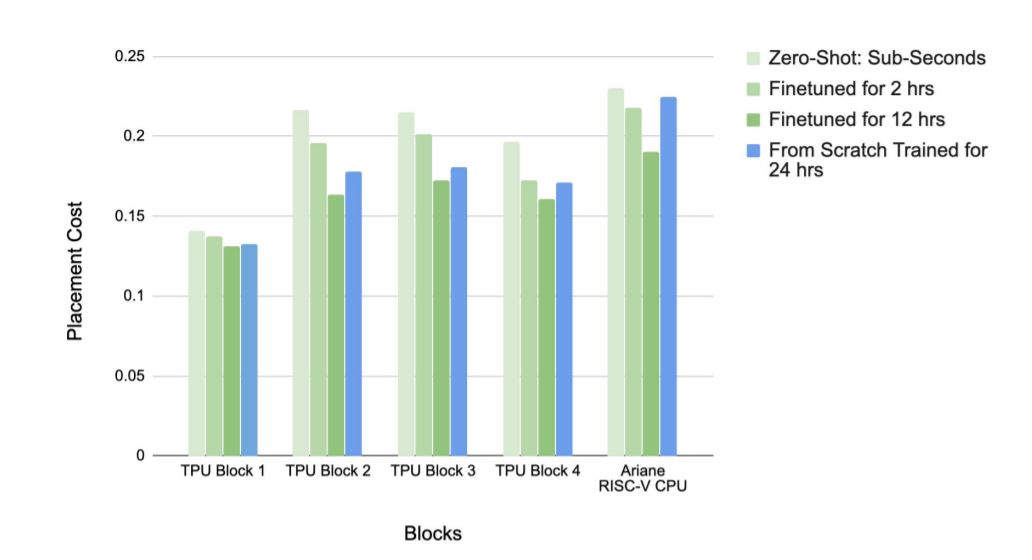
I could see why the barcharts wouldn’t start from 0 - maybe the marginal decrease in placement costs is incredibly large, and deserves a larger emphasis - but then it’s weird to include a properly formatted bar chart.
Conclusion
There was no “point” in this blog post - I just wanted to share my thoughts on this one niche thing. I doubt that there were nefarious reasons behind the “misleading” barchart in question, and it feels more like an inconsistency issue rather than trick.
On a different note, the topic/research in this paper is awesome.
Citations
- arXiv:2004.10746v1
- Mirhoseini, A., Goldie, A., Yazgan, M. et al. A graph placement methodology for fast chip design. Nature 594, 207–212 (2021). https://doi.org/10.1038/s41586-021-03544-w
Footnotes
-
reading, and rereading, and rereading… ↩
-
If you’re interested in measuring visualization distortion, there are metrics for that! The “lie factor” is one that I was taught, but wikipedia has more. ↩