Practical Statistics for Software Engineering - Descriptive Statistics
29 Aug 2021Introduction
I thought I would continue the series with a discussion of descriptive statistics (the process of describing data) and some important tangents. The goal isn’t to list summary statistics and formulas (countless medium articles do that already), but focus on the thinking necessary for creating representative, descriptions of data.
A lot of the figures/tables were made from fictional datasets and for demonstrative purposes only. They have the possibility of not being realistic distributions, so watch out for that.
What are Descriptive Statistics?
The textbook Statistics defines “descriptive statistics” as the “art of summarizing data”12 (and the Wikipedia definition is pretty much the same). The goal of descriptive statistics is to communicate a lot information as simply as possible, reducing the cognitive load for the audience (and you).
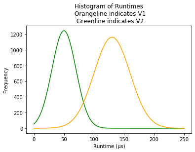
A table of descriptive statistics often comes with several summary statistics (a single number summarizing a large amount of data3) or visualizations. For example, here are some possible descriptive statistics for benchmarking two versions of an imaginary program.
| Group | mean | std |
|---|---|---|
| V1 | 130.0 | 30.2 |
| V2 | 50.1 | 19.7 |
Components of Descriptive Statistics
The components of descriptive statistics generally fall under two categories: summary statistics and visualizations.
- Some examples of summary statistics are average/mean, median, mode, percentiles, correlation, regression slopes, standard deviation, IQR ranges, kurtosis, etc
- Some examples of visualizations are histograms, frequency tables, scatter plots, line charts, cross tabulation, pie charts (but a lot of data visualization enthusiasts disapprove), etc
The Importance of Formulas
Even though you’ll be using programming/query languages that have these formulas baked in, it’s still important to know the formula for each statistic. Comprehension of the underlying math gives you insight into when a formula is or isn’t appropriate.
The Importance of Visualizations
Even though I lean towards using tables over charts, visualizations are a critical component of any analysis. We need visualizations because summary statistics can be lacking. Visualizations can point out obvious details that summary statistics can’t (sparing you a bunch of time). The classic example is “Anscombe’s Quartet” - four datasets with (almost) identical summary statistics. In the quartet we have four different examples of linear regressions where:
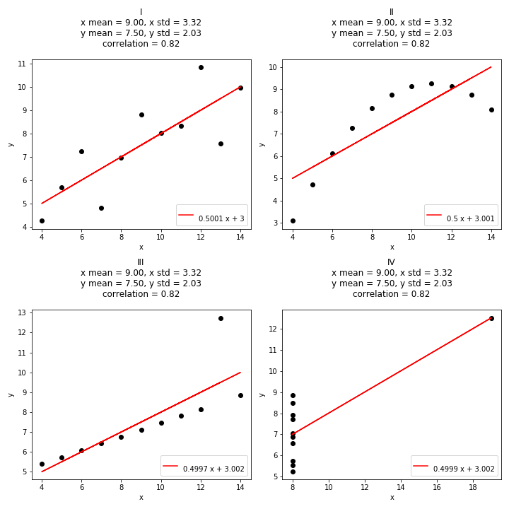
- The first dataset is a simple linear regression - seems normal
- The second dataset is some polynomial curve
- The third dataset contains an outlier that ruins the dataset and actually throws off the fit
- The fourth point has another outlier that has a high leverage to forcing a correlation coefficient
As we can see from the summary statistics above each chart, these four plots have similar summary statistics - and an individual might assume that these four plots were identical! We could use other numbers or techniques to notice these differences without a visualization (kurtosis, rank correlation, etc) but the point is that it involves a lot more work.
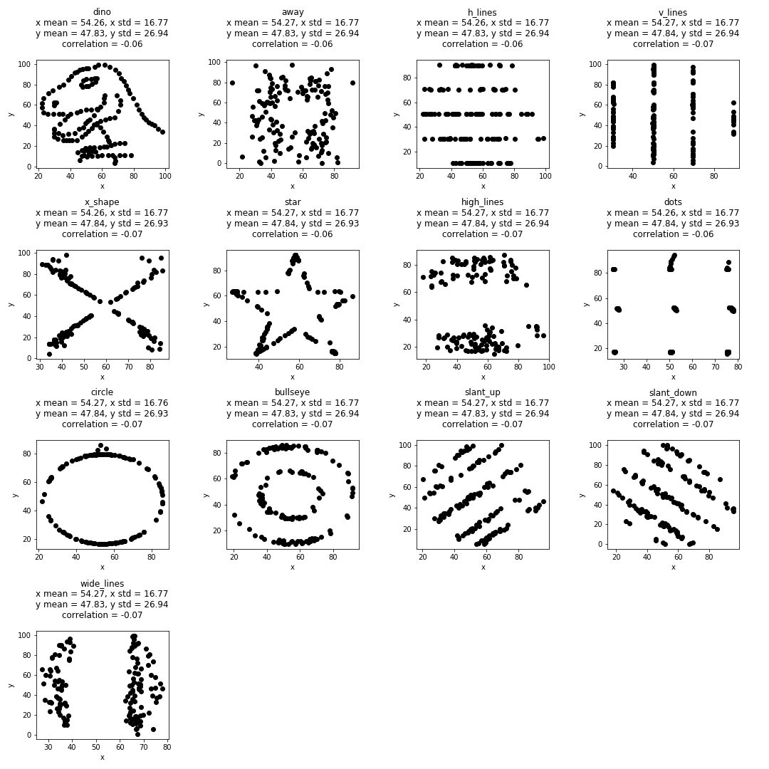
As a tangent, the researchers at Autodesk made a funnier version of the quartet called the Datasaurus Dozen. A set of thirteen ridiculous datasets with almost identical summary statistics (x mean, y mean, correlation coefficient). Here’s a link to my github repo that generated these plots with matplotlib
Why do we need descriptive statistics?
We need descriptive statistics because they provide brevity, context, and insight to our data which helps us with the “next step” in any analysis.
For instance, we can use frequency tables to guide the next steps of your debugging process. This (completely fictional) frequency of Exception logging in your hypothetical staging environment might lead you to think, “Hmm… I think Johnny pushed unfinished code into the staging environment again”.
| ExceptionType (Staging Env) | Frequency (24H) |
|---|---|
NotImplementedException("TODO") |
43 |
BusinessLogicException1("Invalid ...) |
105 |
BusinessLogicException2("Connection ...) |
22 |
BusinessLogicException3("Toggle disabled") |
47 |
Reason 1: Brevity
Summarizing data is important for brevity - most people won’t have the time or energy to comb through the logs as you did. Instead of looking at every individual record, you can just have a 2-4 numbers to get an idea about the status of your service/cron job/etc.
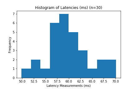
| Summary Statistic (n=30) | Value (ms) |
|---|---|
| mean | 32.1 |
| std | 5.1 |
Made-up Situation
If someone asks how long it takes for a new program or process some input, you could provide them all the logs like this:
| Trial # | Time (ms) |
|---|---|
| 1 | 10 |
| 2 | 2 |
| 3 | 140 |
| 4 | 4 |
| 5 | 7 |
| … | … |
| 999 | 16 |
| 1000 | 5 |
During the process they will be confused on which running times are representative of the “true” running time of your process. Are measurements like 140ms abnormally slow and measurements under 15ms abnormally fast? Or are the running times below 10ms the expected average? To make the job easier, you could provide them a table like this:
| Summary Statistic (n=1000) | Value (ms) |
|---|---|
| mean | 32.1 |
| std | 40.1 |
| median | 31 |
| 95th percentile | 47 |
From this table, it’s much faster to observe the processing time (and its variability) through its summary statistics. Even better you could give them a histogram of the results, with the summary statistics imposed on top!
Which Summary Statistics to include?
Deciding on the combination of summary statistics is a balancing act. One or two numbers will rarely communicate a complete picture about the series, but it can provide “enough”. It might be tempting to go overboard and include every number possible - after all every additional metric (usually) provides more information.
- For example, if the mean and median of the dataset are very close same, we can conclude that the distribution has minimal skew.
- If we include the calculation for kurtosis we can see exactly how much that skew is.
A lot of auxiliary information can provide helpful information, but also pollutes the interpretability of your summary. An exercise to practice is “what is the bare minimum I need to see to be able to answer X question?”
Reason 2: Context
Descriptive statistics is a great way of providing and establishing context, especially if your audience doesn’t have intuition or experience with your domain4.
For instance:
- Engineer A: “For some reason, our API call to X endpoint takes around 30 seconds”
- Engineer A’s Product Lead: “Ok…”
- Engineer A: “Normally it only takes 0.2 seconds, and we need to call this endpoint around ~1 million times a day”
- Engineer A’s Product Lead: “WHOA EMERGENCY MEETING”
Alternatively:
- Engineer A: “For some reason, our API call to X endpoint takes around 30 seconds”
- Engineer A’s Product Lead: “Ok…”
- Engineer A: “Normally it only takes 25 seconds, and we need to call this endpoint around ~500 times a day”
- Engineer A’s Product Lead: “We can table that for later”
Reason 3: Insight
In a different blog post, summary statistics and visualizations of our latency distributions helped guide the types of distributions to model our inference (predicting the probability of certain slow cases).
Imaginary Example
Let’s say that there needs to be a monitoring dashboard in $YOUR_MONITORING_VENDOR, and you picked up the ticket for building a dashboard for profiling performance of $SOME_MEASUREMENT - how do you do this?
Step 1: Clarify Your Goals
The first step is to understand the requirements exactly. How do we define “performance”? Is performance latency? execution time? resource utilization? the ratio of processing time to payload? latency for 98% of users? Performance might be all or none of these things, and it’s awkward when your expectations misalign with your manager’s.
Step 2: Visualize Your Data
The next step is to visualize your data ahead of time - this might save you a lot of time down the road. Try a histogram, a time series, scatter plots, etc. Since you’re using $YOUR_MONITORING_VENDOR odds are you’re stuck using the platform’s query language to create visualizations - make sure you’re “okay” at filtering and manipulating data.
Step 3: Picking Summary Statistics
Depending on the data, the “correct” summary statistic can differ - here’s what I mean.
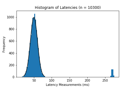
Ideal Scenarios
If our distribution looks something like this:
then using mean and standard deviation are perfectly fine. However, data tends to be uglier and more chaotic than contrived example like this.
Skew + Outliers
If the distribution has noticeable skews or outliers like these:
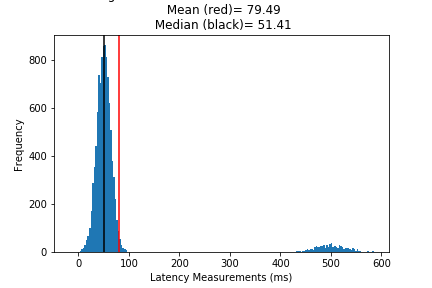
then we need more robust statistics. Very clearly most of your data occurs between 30 and 70 ms, but the abnormalities cause our mean to deviate from our understanding of the “center”. From the histograms above, the median tends to be closer to the high frequency “center”, at least more than the mean.
Different Distributions
Finally - are you really dealing with skew, or is it just a different distribution? Not everything is a normal distribution, so don’t fall into that trap.
Tangents
Caution w/ Measurements (Be careful about what you’re really measuring)
It’s easy to think that a measurement/calculation is accurate, but it’s very easy to get wrong - especially when working with computers. A hypothetical might be average compilation time between Linux & Mac machines. When you average compilation times, you might think you’re comparing the difference between operating systems, but in reality you could be measuring the difference between a bazillion confounding factors just within the hardware (Processing speed, Storage, ISA, etc).
In the previous case study, I mention multi-modal distributions because two different processes occurred depending on the parameters of a request. While being intentionally vague, the dashboard mean seemed like it was measuring the average time to complete a request to a new endpoint with a new feature pushed to develop, but the flow was disabled (as a toggle) in most production environments (i.e completion time = 5ms instead of 60ms). As a result, when you took the average “completion time”, the result was subtly low. Fast for what it was, but not suspicious to someone inexperienced.
This tweet shows that arbitrarily renaming a method from “A” to “B” improved runtime performance. The reason has to do with .NET’s compilation order - complete twitter explanation is linked here. With such a ridiculous optimization from something as innocuous as naming, it’s incredibly easy to attribute performance improvements to something like seemingly better logic or architecture.
This isn’t a problem specific to rust or .NET as well. I saw a conference talk (I cannot find the link/paper) on a tool for randomizing path lengths for testing environments to better measure execution times of programs. The presenter gave a background how they discovered path lengths could lead to different execution times depending on the machine it was run on.
Here I made a mistake thinking my recursive algorithm was incredibly fast because of the use of the lru_cache decorator, but in reality the cache was saved in the repeat trials of the benchmark.
The point being that - when you’re collecting data, are you measuring differences in performance from code/algorithm/architecture changes or are you really measuring compiler optimizations, hardware acceleration, more provisioning?
TL:DR - It’s easy to misinterpret what you’re really measuring, especially when you’re working with so many abstractions (like computers)
Meaningless Summary Statistics
Sometimes people will calculate summary statistics in a context that makes no sense. These situations happen in the wild, but I’ve never bothered to record most of them.
A common example is taking the average of star ratings. Star ratings have numbers, but they belong on an ordinal scale rather than interval/ratio scale. The ranking of the stars matter (5 stars is better than 1), but the difference between star values is not consistent (the difference between 3 to 5 stars is much larger than 1 to 3). As a result, taking the “average” is a meaningless operation that doesn’t really provide any information. This idea falls under “permissible statistics”.
Another example I’ve critiqued is “averaging colors” - there visualizations using “average colors” as a representation of color usage in movies. The executive summary is that performing arithmetic operations on color is not a meaningful operations, especially the more colorful an image becomes. For example, averaging the (R, G, B) colors on a rainbow just results in the color brown.
TL:DR - Summary statistics cannot be applied arbitrarily - thinking is necessary
Dealing with Outliers: Income Statistics
This has been briefly mentioned, but dealing with outliers is important for reporting. Choosing more robust approaches (choosing median over mean, Mann-whitney U test over normal hypothesis testing, spearment coefficient vs pearson) is important when working with “real” world data.
For instance, people rarely use “average income” when reporting income statistics - people report the median income instead. Why is that?
Data provided by the federal reserve we see that (real) mean income is almost $20,000 more than the median income late 2020 (~54000 vs ~36000).
If we were to apply semantics to these numbers, one could say that the “typical” household makes $54,000 or $36,000 depending on the household. The problem is that the mean household is ~150% richer than the median household, depicting the typical house hold as much richer than it is, which also distorts how economic policy is created as well.
The reason for the discrepancy between the median and mean is based on their formulas. The median is independent of the values of each household, and strictly takes the income at the 50th percentile. On the other hand, the average accounts for the dollar earned. When individuals earn an extraordinary small or large amount of money, they can drag the mean down or up. In this case, when individuals in the US earn an extraordinarily large amount of money, these individuals drive up the mean. The problem is that this skewed average doesn’t represent the typical U.S household well and would show this household to be much richer than they are.
TL:DR - misrepresentation is bad, which is why median income is a “better” measure over mean
Tangent: Software & Software Engineering Metrics
Since this is a SWE context - something that rules our lives is “metrics”. Metrics (by themselves) don’t really involve any statistics - they exist to measure something concrete (software churn rate, lines of code added, # users) or abstract (usability, engagement, code quality, maintainability, happiness).
Sometimes I appreciate the obsession over quantifying every aspect of the software process from sales to engineers, but at the same time I think that they’re a lot of flaws in their methods, influence, and politics (to be fair, this obsession is not unique to software but a lot of other corporations). Ultimately, I have a lot of thoughts about metrics that I can’t treat as a tangent.
Conclusion
This was a brief discussion of summarizing data with descriptive statistics, and a collection of tangents that give us insights into the process of making “accurate” descriptive statistics.
Unlike my previous post (where I note that “rigorous statistics” isn’t always the main priority in software), I will argue that accuracy is critical with descriptive statistics. Never be lazy, nor pick blatantly bad measures/metrics because it will just cause pain for everyone down the road. The only trade-off I encourage is precision against expended collection effort/energy.
More reading and research is always recommended. If you have any problems or notice any mistakes free to reach out to me at nablags97 [at] gmail.com.
The next couple of topic will be about inferential statistics (A/B Tests, Basic Hypothesis testing, Sampling)!
Citations
Diez, David M., Christopher D. Barr, and Çetinkaya-Rundel Mine. “Introduction To Data”. In OpenIntro Statistics. OpenIntro, Inc., 2019. D.A. Freedman, R. Pisani, and R.A. Purves. Statistics (4th edition). (W.W. Norton, Inc. New York, 2005) Wikipedia
Footnotes
-
D.A. Freedman, R. Pisani, and R.A. Purves. Statistics (4th edition). (W.W. Norton, Inc. New York, 2005), xiv ↩
-
Now that I have grabbed definitions from academic resources - I’m just going to rely on wikipedia. ↩
-
Diez, David M., Christopher D. Barr, and Mine Çetinkaya-Rundel. 2019. OpenIntro statistics. 10 ↩
-
To give proper credit, I read this tidbit in this CrossValidated post. ↩